Teadasun—a sportswear & lifestyle brand: visual identity through movement, warmth, and the energy of life outdoors. Our design is inspired by the meaning of the name: «a girl from the sun». We aimed for a motivating, active, and approachable brand image.
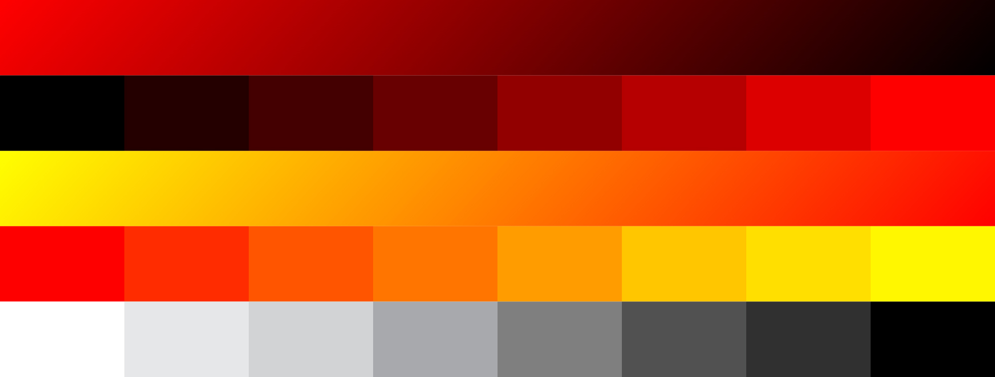
A visual system echoing the emotions and expressions of physical energy: we translated the idea of «rhythmic movement» visually, following a grid—a pattern of motion—that unifies the brand-system: flexible and adaptable across different touch-points. A sun-inspired color palette evokes heat, brightness and motion.